

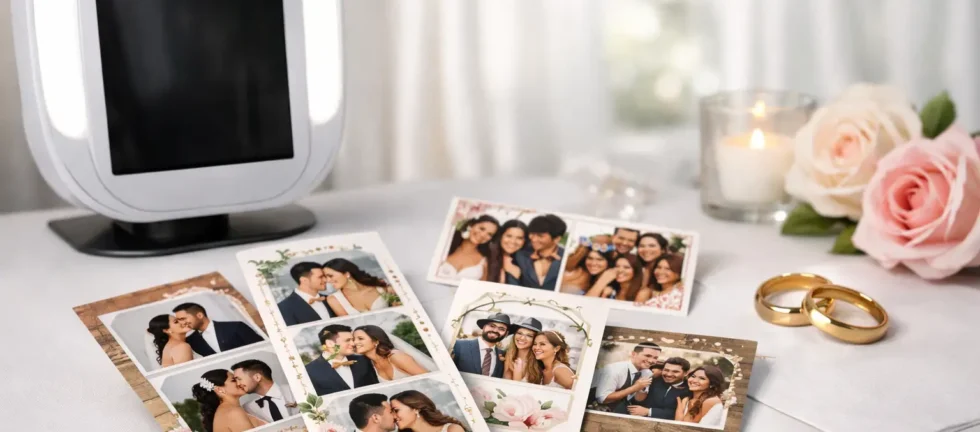
A photo booth print is one of the few wedding details guests will hold onto after the last song, the final toast, and the late-night send-off. This wedding print template guide helps you design that small keepsake with the same intention you bring to your invitations, florals, and tablescape – without turning it into another complicated planning task.
The best template does more than display photos. It gives guests a polished reminder of your celebration, reflects your wedding style, and makes every instant print feel worth taking home. A beautiful design also matters because it frames the image itself. Even professional camera quality and flattering studio lighting can feel less special when surrounded by a cluttered, low-resolution, or poorly matched layout.
Start With the Wedding Print Template Size
Before choosing fonts, colors, or decorative elements, decide how you want guests to use the print. For most weddings, a 2-by-6-inch photo strip or a 4-by-6-inch postcard-style print makes the most sense. Both are easy to carry, display, and save in a memory box or album.
A 2-by-6 strip has a classic photo booth feel. It typically holds three or four photos in a vertical sequence, leaving a smaller area for names, the date, and a design accent. This format is ideal when you want something playful, recognizable, and easy for guests to tuck into a wallet, frame, or guest book.
A 4-by-6 print creates more room to breathe. It can feature one larger portrait, a two-photo layout, or a polished multi-image arrangement with more space for your wedding monogram or a custom illustration. Couples often choose this option for formal receptions, editorial-inspired designs, or celebrations where the stationery suite has a strong visual identity.
There is no universally better size. A lively dance-floor crowd may enjoy the quick, collectible nature of strips, while a refined estate wedding may call for the visual presence of a larger print. What matters is choosing a format that complements the guest experience and your overall design direction.
Match the Template to Your Wedding Stationery
Your photo booth print does not need to copy your invitation exactly. In fact, forcing every design element into a small format can make it look busy. Instead, carry over two or three recognizable details from your stationery suite.
That might be a serif font used for your names, a muted sage green from your menus, a thin champagne-colored border, or a simple line drawing that appears on your welcome sign. These repeated elements create visual continuity without making the print feel like another piece of paper from the invitation envelope.
If your stationery is highly detailed, simplify the booth template. For example, an invitation with watercolor florals, multiple typefaces, and a venue illustration may translate best as a clean print with one floral corner detail and elegant typography. Small print sizes reward restraint.
For couples who are not working with a formal stationery suite, use the venue and season as your starting point. Soft ivory, black, and warm neutral accents suit a classic ballroom reception. A garden celebration may call for gentle greens or botanical linework. A winter wedding can feel elevated with deep navy, evergreen, or subtle metallic-inspired tones rather than literal snowflakes across every edge.
Choose Colors That Photograph Well
A print template is viewed beside bright faces, dark suits, white dresses, and a wide range of guest outfits. High-contrast color choices keep names and dates readable while allowing the photographs to remain the focal point.
Black or charcoal text on a light background is consistently elegant and easy to read. White text can work beautifully on a darker border, but it needs enough contrast to remain clear in print. Very pale colors, thin gold effects, and intricate patterns may look lovely on a screen yet lose definition on a small printed keepsake.
If you are using your wedding palette, reserve the boldest shade for a border, monogram, or small accent. Let the photo area stay visually quiet. Guests should notice the joy in the image first, then the thoughtful design around it.
Keep the Wording Personal but Brief
The wording on a wedding print template should feel unmistakably yours, but this is not the place for a long quote or a full wedding hashtag. A print has limited space, and too much text competes with the photos.
In most cases, your names and wedding date are enough. You can use first names for a relaxed celebration, full names for a more formal event, or a shared last name if that feels meaningful to you. Adding the venue or city can be a nice touch when it is part of the story, especially for a destination wedding or a beloved local setting.
A short phrase can work when it adds personality. Think of language such as “The Best Day Ever,” “Love, Laughter, and Happily Ever After,” or a phrase that has real meaning to the two of you. Keep it concise, and avoid wording that will feel dated once the initial excitement of the day has passed.
Be careful with dates. Confirm the format early, particularly if you are planning a wedding with guests from different regions. Writing out the month, such as “September 14, 2026,” eliminates confusion and looks more timeless than a numeric date.
Build a Layout Around Real Guest Photos
A template should be designed for actual booth images, not just a pretty mockup. This is where working with an experienced photo booth provider makes a noticeable difference. The layout has to accommodate guests of different heights, couples leaning into frame, group shots, props, and spontaneous expressions.
For a strip layout, evenly sized photo windows create a clean rhythm and give guests room to be playful across each frame. A larger 4-by-6 layout may benefit from one hero image paired with two smaller images, especially when the booth captures crisp, studio-lit portraits.
Leave enough margin around the image areas. Narrow borders can look sophisticated, but overly tight crops may make hands, hair, or props feel crowded. The most successful templates balance design with practical breathing room.
It also helps to ask for a proof before the event. Review it at the intended print size, not only on a phone screen. Check that text is legible, colors feel accurate, and the names are spelled correctly. This simple approval step prevents a detail that seemed minor during planning from appearing on every print all night.
Avoid These Common Design Missteps
The most frequent mistake is treating the print template like a digital social graphic. A design that looks striking on a large screen can become difficult to read when reduced to a small physical format. Tiny script, crowded graphics, and multiple competing fonts are the usual culprits.
Another issue is placing important wording too close to the edge. Printers require safe areas, and a professional template designer will account for those boundaries so no date, name, or border detail appears clipped. Low-quality booth services may offer limited template customization or use generic layouts that do not reflect the rest of your wedding at all.
Finally, do not forget the quality of the photo itself. A template can enhance a great image, but it cannot rescue poor lighting, soft focus, or a weak camera. Premium photo booth prints should pair thoughtful design with professional equipment, controlled strobe lighting, and an operator who understands how to create flattering results throughout the reception.
Make the Print Part of the Guest Experience
Your template can also support how guests interact with the booth. If you have an audio guestbook, use a small line such as “Leave us a message” near the booth signage rather than cramming the instruction onto the print. If guests receive digital copies as well as instant prints, the physical design can stay timeless while the digital gallery handles sharing and social moments.
Consider ordering an extra copy of each session for a guest book, if that option is available. Guests can place one print beside a handwritten note while taking another home. In that setting, a 2-by-6 strip is especially practical because it leaves room on the guest book page for messages without overwhelming the layout.
For a wedding where branding is not the goal, personalization still is. Your print should feel like it belongs at your reception, not like a generic party favor handed out at the door. A carefully designed template signals that the experience was considered from start to finish.
When you share your inspiration with a professional provider, bring a few references: your invitation, key colors, the spelling of your names, your date, and one or two examples of what you like. Then trust the design process to simplify those ideas into a print that photographs beautifully and feels lasting. At Zattu Photo Booth, that attention to detail is part of creating a photo booth experience guests remember for the right reasons.
Long after the flowers are gone and the cake has been cut, a well-designed photo booth print can still bring your guests back to the feeling of being there. Choose a template that lets the people, the laughter, and the occasion take center stage.