

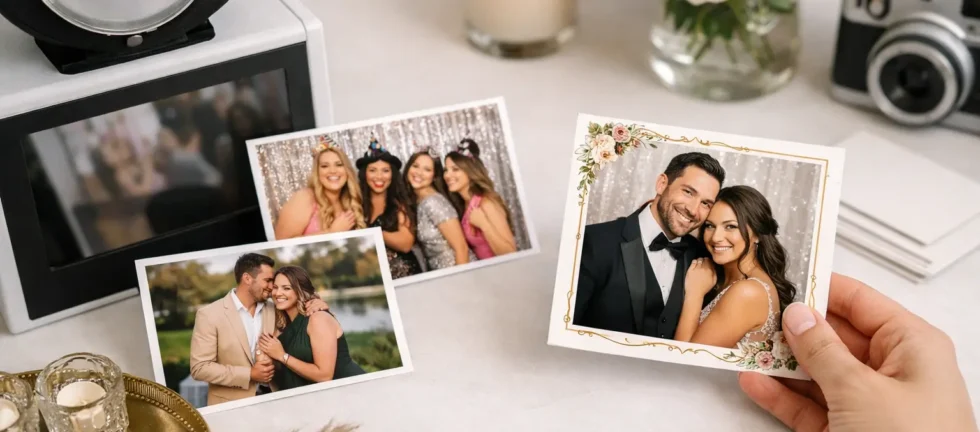
A great event print is more than a photo with a logo added at the bottom. It is a small, tangible reminder of the room, the people, and the reason everyone gathered. Learning how to personalize event prints means making those few inches of paper feel intentional without crowding out the moment that matters most: your guests looking their best.
For weddings, galas, corporate celebrations, and milestone parties, the strongest designs balance event identity with a polished portrait. The print should feel unmistakably yours, yet still be something guests want to display on a desk, fridge, or photo wall after the celebration.
Start with the event’s visual identity
Before choosing colors, fonts, or artwork, define the visual direction of the event. A black-tie gala may call for restrained typography, a refined monogram, and a clean black, ivory, or metallic palette. A summer wedding might feel more at home with soft florals, warm neutrals, or an illustration inspired by the venue. A corporate event usually benefits from a layout that reflects the brand clearly while remaining guest-friendly.
The goal is not to reproduce every detail from an invitation suite or brand guide. Instead, choose two or three recognizable elements that create continuity. That could be a signature color, a typeface family, a subtle pattern, a crest, or a campaign line. When every design element competes for attention, the print begins to feel like an advertisement or a flyer rather than a keepsake.
For corporate functions, a logo should be visible but proportionate. A discreet logo placement, event name, and date often make a stronger impression than a large branded block across the image. Guests are far more likely to keep a print that looks like a premium photo first and branded collateral second.
Choose a print layout that suits the guest experience
Your layout affects both the design and how people interact with the booth. A classic two-by-six strip is playful, compact, and ideal when guests will take several expressive poses. A four-by-six print offers more room for a single polished image or a multi-photo collage. Larger formats can feel especially elevated for weddings and formal events, but they require a design that leaves enough visual breathing room.
Think about what guests will do with the print after the event. Photo strips slip easily into purses, wallets, and guest books. A four-by-six portrait can be framed or displayed without trimming. If the booth includes an audio guestbook or a physical guest book, a duplicate print gives guests one copy to take and one to leave behind with a message.
The number of images matters, too. Three or four frames encourage spontaneity and movement. One strong portrait feels more editorial and works well for a sophisticated brand activation or formal reception. There is no universally right answer. It depends on whether your priority is playful participation, elegant portraiture, or a blend of both.
Personalize event prints without overdesigning them
The most common design mistake is trying to fit every meaningful detail onto the print. Names, dates, hashtags, venue names, slogans, florals, logos, QR codes, and themed graphics can quickly overwhelm a small format.
Keep the essentials clear: the event name or names, the date, and one visual signature. If a hashtag is central to a campaign or wedding social strategy, include it in a readable but secondary position. If it is not something guests will actually use, leave it off. A print does not need to carry the entire event program to feel complete.
Typography deserves particular care. Script fonts can look beautiful for names or a short phrase, but they are harder to read in small sizes. Pair them with a simple, high-contrast font for dates and supporting information. Avoid using more than two font styles. Consistency always feels more premium than decoration for decoration’s sake.
Color needs the same discipline. Deep, saturated borders can look dramatic on screen but may dominate the final image, especially if guests are wearing colorful outfits. Neutral borders, soft textures, or small accent details tend to age better. For a bold company palette, use the primary color as an accent rather than making every inch of the template intensely branded.
Make room for the photo
The photo should remain the visual center of the print. Leave generous space around faces, avoid placing text over key parts of the frame, and make sure template elements will not clash with likely wardrobe colors. This is especially important at weddings, where guests may wear black, navy, jewel tones, or formal patterns.
A polished template cannot compensate for poor lighting or a weak camera. Print design and image quality work together. Studio-grade lighting creates flattering skin tones and clean detail, while a professional camera and lens give the final print the clarity that makes a custom design feel genuinely elevated. A beautifully personalized frame around a soft, poorly lit image will still look disappointing.
Use personalization that reflects the occasion
Personalization should feel specific to the event, not generic. For a wedding, that may mean a custom monogram, a watercolor element taken from the stationery, or a line of text that matches the couple’s tone. A winter celebration could use a subtle seasonal texture rather than clip-art snowflakes. A milestone birthday can lean into a favorite color, a meaningful year, or a playful phrase that friends will recognize immediately.
For corporate events, start with the purpose of the gathering. An awards night may feature a refined step-and-repeat-inspired border and the event title. A product launch might use campaign imagery, a short message, and a color system that carries through the room. At a holiday party, the design can be warmer and more relaxed while still keeping the organization identifiable.
When designing for a themed party, resist the urge to turn the print into a costume. A few well-chosen cues usually work better than an overloaded theme. For example, a vintage-inspired event may need muted tones, an art deco border, and period-appropriate lettering. It does not need five separate graphics in every corner.
Plan the print alongside the backdrop and props
Event prints look their best when they are part of one visual system. A sophisticated floral print template paired with neon props and a busy backdrop can feel disconnected. Likewise, a dramatic black-and-gold gala template may lose impact against a casual, brightly patterned background.
Consider the booth environment as a whole. The backdrop sets the scene, props influence the energy of each image, and the print is what guests take home. If your event has a strong aesthetic, share invitation artwork, color references, and inspiration images early in the planning process. This gives your photo booth provider time to create a template that belongs in the event rather than appearing as an afterthought.
There is also a practical reason to coordinate early. Custom details need proofing. Names must be spelled correctly, dates confirmed, logos supplied in usable formats, and colors reviewed before event day. A professional operator should make this process straightforward, with clear communication and a final approved design rather than surprises at setup.
Prioritize print quality and a clean proofing process
A personalized template is only as good as its final production. Fine text, pale colors, and intricate patterns can look different on a printed photo than they do on a phone or laptop. Ask to review a proof at the intended print size, not only a full-screen mockup. This is where spacing, contrast, and readability become clear.
It is also worth asking what equipment will create the images. Premium prints begin with premium capture. At Zattu Photo Booth, studio-grade three-point strobe lighting and a Nikon Z9 camera help produce crisp, flattering images before the template is ever applied. That attention to the foundation is what allows small design details to reproduce cleanly and gives guests a print worth keeping.
Be cautious of packages that promise extensive customization but provide little clarity on proofing, print stock, operator support, or backup planning. A low price can look appealing until a dark venue, unreliable setup, or weak image quality turns a meaningful keepsake into something guests leave behind.
Give guests a keepsake, not just a branded photo
The best personalized event prints do not ask guests to admire the design. They invite guests to remember how the event felt. Whether you choose a refined wedding monogram, a clean corporate mark, or a playful birthday detail, keep the image at the center and let the personalization support the story.
When the visual details, professional lighting, and print quality are handled with care, each photo becomes a small piece of the celebration that guests are genuinely happy to take home.