

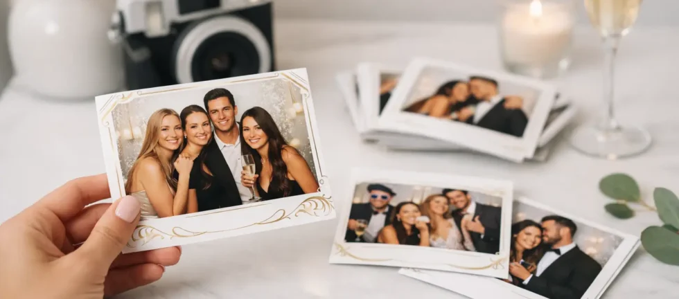
A guest takes a print home, places it on the refrigerator, tucks it into a scrapbook, or keeps it on their desk. That small card can outlast the event itself. Learning how to design branded photo prints means treating every print as a keepsake first and a branding opportunity second. When the design feels polished, personal, and easy to read, guests will want to hold onto it.
For weddings, galas, company celebrations, and milestone parties, the best photo print templates do more than display a logo. They carry the feeling of the room, reinforce the occasion, and frame guests in a way that looks intentional in person and on camera.
Start With the Moment You Want to Preserve
Before choosing colors or adding a logo, define the role of the print. A wedding print might preserve the couple’s names, date, and carefully chosen aesthetic. A corporate event print may need to carry an event theme, campaign message, sponsor recognition, or a refined company identity. For a gala, the goal may be an elevated keepsake that looks appropriate beside formal attire and a premium backdrop.
That purpose should shape every design choice. A busy, promotional template can be appropriate for a product launch, but it may feel out of place at a black-tie fundraiser. Similarly, a minimalist wedding design may look beautiful, yet it needs enough contrast and detail to remain recognizable after guests take it home.
Start by identifying the one detail guests should remember. It could be the newlyweds’ names, the event title, a milestone birthday, or a company campaign. Give that detail visual priority instead of asking the print to communicate everything at once.
How to Design Branded Photo Prints Around the Photo
The photograph is the reason the guest is holding the print. It deserves most of the available space.
A common design mistake is building a beautiful template first and squeezing the image into whatever area remains. This can make faces look small, crop groups awkwardly, or create a print that feels more like an advertisement than a souvenir. Begin with the photo area, then reserve clean space for branding and event details.
For a classic 4-by-6 print, a full-width landscape image with a narrow branded strip at the bottom is a strong option for corporate events and parties. It provides room for group photos while keeping the logo and event name visible. A vertical layout can be more flattering for individual portraits and couples, especially when the booth experience is designed around studio-style lighting.
Photo strips are another popular format, particularly for weddings and social celebrations. They create a familiar, playful experience, but the branding must be simplified. Use a small logo, monogram, or event name rather than a full block of text. The narrower the format, the more every line of copy competes with the images.
Leave Room for Real Guest Behavior
People do not always stand perfectly centered. Groups lean in, children move, and energetic guests fill the frame. Avoid decorative borders that sit too close to faces or edges that could make the image feel cramped.
If the print design uses frames, floral artwork, or a custom border, keep the central photo area generous. Test it with a two-person portrait, a large group, and guests of different heights. A template that works only for one posed sample image is not ready for an active event.
Make Branding Clear Without Making It Loud
Branded prints should be recognizable at a glance, not overwhelming. In most cases, one logo placement is enough. Repeating logos, large web addresses, and dense sponsor blocks can turn an otherwise premium print into a handout guests are less likely to keep.
For corporate events, use the official logo file whenever possible, preferably a high-resolution PNG, SVG, or vector file with a transparent background. Do not rely on a logo pulled from a website or copied from a small email signature. Low-resolution files can appear soft, jagged, or pixelated when printed, which immediately weakens a polished event presentation.
Keep the logo away from the busiest part of the image. A lower corner, bottom band, or dedicated footer typically works well. If several sponsors need recognition, establish hierarchy in advance. The presenting sponsor may receive the most visible placement, while supporting sponsors can be included more subtly. Trying to give every logo equal prominence usually creates clutter.
For private events, branding can be more personal. A wedding monogram, a custom illustration of a venue, or a small phrase that reflects the couple’s style often feels more meaningful than a traditional logo. The principle remains the same: make it part of the design, not an afterthought pasted over the photo.
Use Color and Type That Print Beautifully
Colors that look striking on a phone screen do not always reproduce the same way on paper. Very pale text may disappear against a bright photo, while overly dark design elements can make the print feel heavy. Strong contrast is what makes a template readable in a dim ballroom, bright venue lobby, or busy reception space.
Choose one primary brand color and one or two supporting colors. This keeps the design cohesive and gives the photo room to breathe. If an event palette includes several shades, use the most recognizable tone for accents and reserve neutrals for backgrounds, borders, and text.
Typography should serve the guest experience. Script fonts can be beautiful for names or a short phrase, particularly at weddings, but they are difficult to read when used for dates, sponsor names, or longer event messaging. Pair a decorative font with a clean, legible typeface for practical details.
Small text is another frequent problem. If it cannot be read quickly while holding the print at arm’s length, it is probably too small. This matters even more on photo strips, where a design can look readable on a large monitor but become difficult to interpret once printed.
Match the Template to the Event Environment
A branded print should look connected to the event without trying to duplicate every detail in the room. Pull from the invitation suite, step-and-repeat backdrop, floral palette, signage, or campaign visuals, then simplify those elements for the print.
At a holiday party, a deep green or elegant metallic-inspired accent can feel festive without resorting to oversized clip art. At a corporate gala, clean geometry, restrained color, and refined typography may be a better fit than heavily themed graphics. For weddings, the most successful templates often echo the stationery or venue style in a subtle way, whether that means soft botanical details, modern minimalism, or timeless black and white.
The backdrop matters, too. A patterned backdrop paired with a busy template can make every image feel visually crowded. When the background contains texture, sequins, florals, or branded graphics, a simpler print layout is usually the better choice. If the backdrop is clean and neutral, the template can carry more visual personality.
Design for Print Quality, Not Just Screen Approval
A template is only as good as its final printed result. Ask to review a proof at the actual print size, not simply a digital mockup. This is the fastest way to catch tiny text, weak contrast, cropped details, or colors that need adjustment.
Professional image capture also makes a meaningful difference. A thoughtfully designed print cannot compensate for dim, grainy photos, unflattering angles, or inconsistent lighting. Studio-grade equipment, professional lenses, and controlled strobe lighting give the design a strong image to work with, preserving detail in formalwear, skin tones, and group portraits.
This is one reason premium photo booth service is about more than a template. The layout, paper, print quality, camera output, lighting, and operator attention all contribute to the keepsake guests receive. A low-cost booth may offer customization on paper, but poor image quality can make even a strong design feel disappointing.
Approve the Details Before Event Day
A polished print template should be finalized early enough to review it calmly. Confirm spelling for names, dates, titles, hashtags, sponsor marks, and any special messaging. If the event has multiple print designs, such as one for a welcome reception and another for an after-party, make sure the operator knows exactly when each version should be used.
It also helps to decide whether guests will receive one print, duplicate prints, or a combination of prints and digital sharing. Duplicate prints are especially valuable at weddings, where one copy can go home with the guest and another can be added to a guestbook. For corporate events, instant digital delivery can extend the reach of the branded experience while the physical print remains the more personal takeaway.
A professional photo booth partner should make this stage straightforward, offering clear proofing, practical guidance, and a design that supports the event rather than creating another item for the planner to manage. Zattu Photo Booth approaches custom print design with that same focus on quality, clarity, and dependable event-day execution.
Before you approve any template, hold it to one simple standard: would a guest still want this print if the logo were not there? If the answer is yes, the branding is likely doing exactly what it should – adding meaning to a memory guests are genuinely happy to keep.